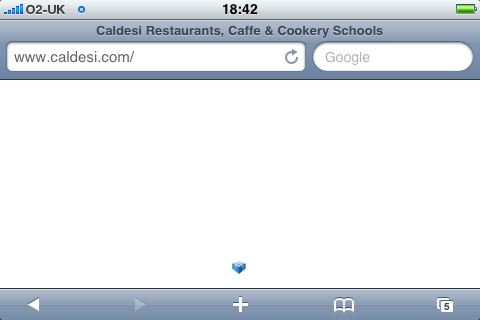
www.caldesi.com screen shot 26-March-2009
Rubbish! No text alternative. What if I had been in the area keen to call them up and make a reservation? So I dropped an email to the "design" company:
--
Tue, Mar 31, 2009
xxxxxx
When accessing http://www.caldesi.com/ on an iPhone I get, effectively, a blank screen (see attached screen shot). I guess the site would not work on a blackberry or an ordinary mobile phone either. You really should provide a low-tech html text alternative unless you think typical iPhone owners are not a suitable target demographic for a restaurant and cookery school.
And the link to your site at the bottom of the page is broken: Site design by Originator © 2009 links to http://www.caldesi.com/www.originator.co.uk - methinks someone forgot the http:// and that is how it resolves.
Regards
Mark
--
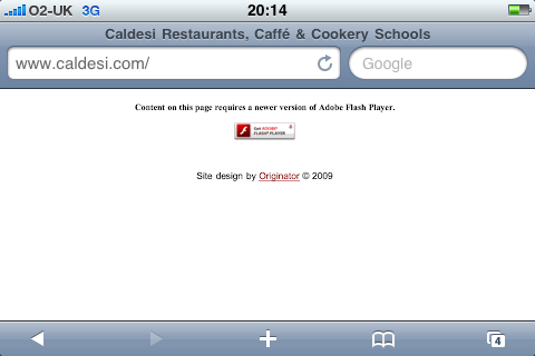
Recently I went back to check and, yes, it had changed but not really what you would call an improvement. And the link to their site is still broken.

www.caldesi.com screen shot 21-July-2009
Maybe the answer is to educate the clients as some design companies just do not seem to understand accessibility, cross-browser support, standards compliance or a user centric view of the web.


1 comment:
Not only iPhone or other mobile users, but people with dialup lines (though maybe those folks can't afford that restaurant, so they don't matter) and people with visual impairments. Flash can be made relatively accessible (although not entirely, see http://www.webaim.org/techniques/flash/) but it takes some work; and one wonders whether people who don't provide a text alternative would take the trouble to do that work.
Post a Comment