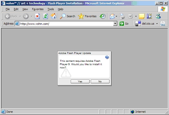
Not even a "Click here for text version" or "Skip animation". Am I going to spend time downloading and installing the very latest software so I can see some flash animation? No.
Anyway it is a corporate laptop and against company policy to install unauthorised software. So I click "No" expecting the html alternative site. What I get is this:

So I click "OK" and get this:

A completely blank screen. Utterly content free. Hmmm! Would you buy web design services from this company?
Perhaps they should read: "Flash: 99% Bad" or "Top Ten Web Design Mistakes of 2005" or "Making Flash Usable for Users With Disabilities". The articles may be a couple of years old but the song remains the same. And I am sure Google would throw up a few more articles on the same theme.


2 comments:
Hmmm! very nice information
Ha!
So true. And pretty much any site with an animated front page, that says "loading" gets a quick off-click from me.
Web designers: Your front page should hook people in by giving a preview of its content. If you want to use flash, then put it AFTER the entry page.
We might just stay to watch that animation you think is so clever. But probably not.
Post a Comment